Getting Started
Foundations
Components
Button
Checkbox
Date picker
Dialog
Flyout
Item picker
Notice
Radio button
Segmented control
Select
Tab
Tag
Text area
Text input
Toast
Toggle
Patterns
Resources
Built using the Blueprint foundations, our common components are building blocks for creating a user interface.
Buttons allow users to perform actions
Checkboxes allow users to select one or more options in a list
Date pickers allow users to enter or select a single date
A dialog is a conversation between the system and the user that can provide critical information or ask for a decision
A flyout gives users additional context, definitions, and other supporting messages
Item pickers allow users to select a single item or multiple items from a set of options
Notices inform the user with system feedback with minimal or no user interactions
Radio buttons allow users to select one option from a set of mutually exclusive choices
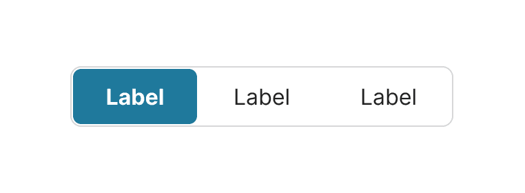
Segmented controls allow users to choose from a set of mutually exclusive options
Select allows users to choose one option in a list
Tabs organize content by grouping similar information into multiple sections
Tags can represent locations, keywords or attributes
A text area allows users to enter and edit long form text
Text fields allow users to enter and edit text
Toasts provide the user immediate and the least disruptive system feedback with minimal action
A toggle allows users to turn a single option on or off