Dynamic type
Dynamic Type allows iOS users to select their system’s text size to improve readability.
What is Dynamic Type?
Dynamic Type is an iOS feature that allows users to change the size of the text on their screens based on their needs and preferences. Dynamic Type consists of 12 total text sizes. Approximately one third of iOS users do not use the default text size. Accommodating dynamic content sizes in Redfin design improves accessibility by allowing readability for those who require larger text.
Selective sizing
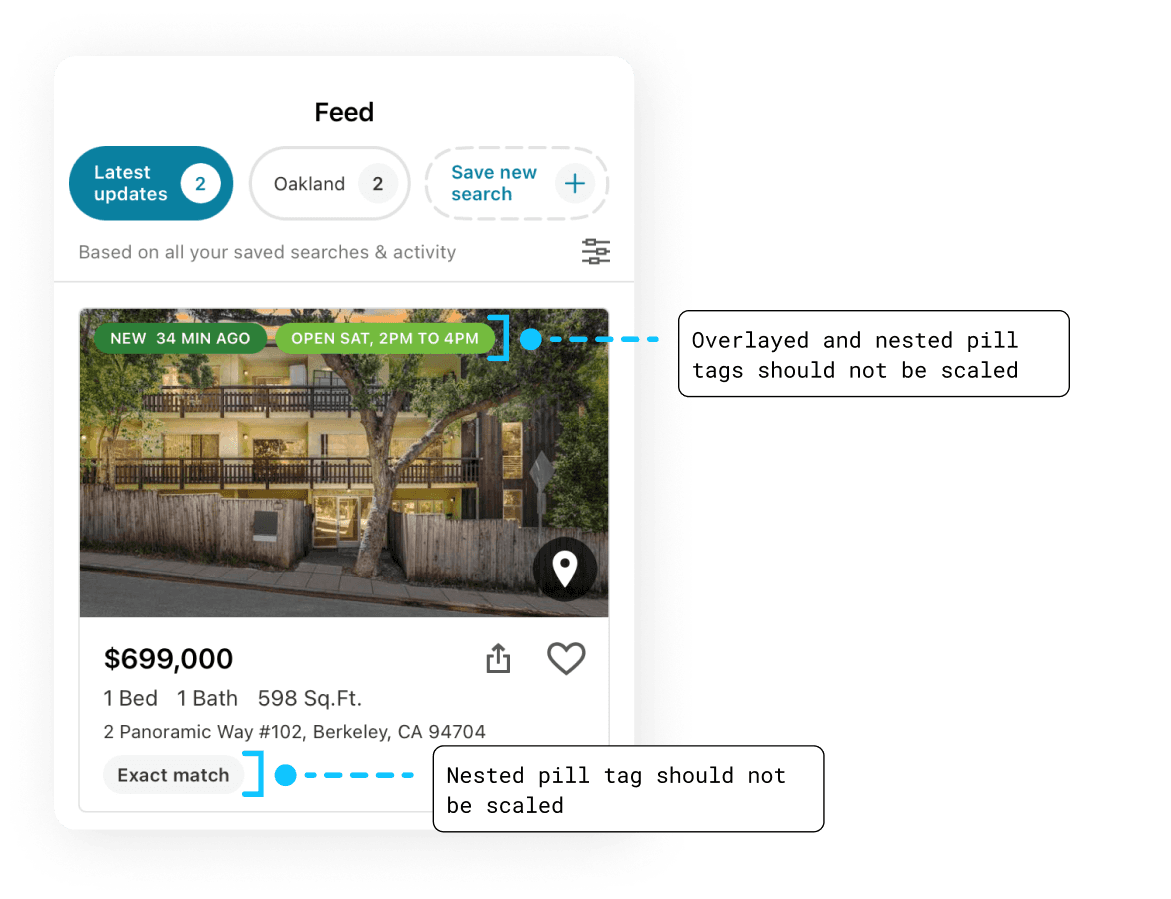
To prioritize the most important content on a page, some elements should not be scaled according to user preference.
Sizing guidelines
As a general rule, all elements within the scrollable area of a page should be scaled according to system preferences. Due to limited screen space, fixed elements such as search and navigation should not be scaled.

An exception to this rule is for nested components or components that overlay other page elements. These elements should be handled with caution as scaling these elements can draw attention and hide important information beneath them.
Preserving hierarchy
When selectively sizing elements, ensure content hierarchy is not disrupted and attention is still drawn to the important elements on the screen.


Icon scaling
Icons accompanied by a text label should scale alongside the text to prevent disruption of hierarchy.


Designing for dynamic content
The following guidelines help us design for dynamic content sizes.
Column layouts
When content is enlarged, opt for simple column layouts to make use of vertical scrollable space.

Avoid using complex layouts like grids.

Complex custom layouts can also be converted to a column layout.


Expandable containers
Containers should flexibly expand to fit enlarged content and ensure it is viewable.


Multi-line text and scrollability
Text should become multiline when enlarged, even within buttons. To accommodate for increased content height, pages should be scrollable.