
Color
The color system expands on the core brand palette with guidelines that ensure consistency while meeting accessibility standards.

Accessibility and contrast
All of the colors in the Blueprint color system were chosen with accessibility in mind and ensuring sufficient contrast ratios for text, icons, and background styles. For example, background values 0–300 paired with text values 700+ ensures WCAG AA compliance.
Color and typography
The suggested text colors adhere to accessibility standards and are highly recommended.
Primary
Text
color-text-primary
Secondary
Text
color-text-secondary
Links
Text
color-text-accent
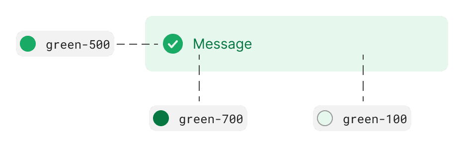
Semantics or showing status
Semantic colors help to communicate feedback, such as information, confirmations, cautions, and errors to Redfin users to help them make the right decisions. Color can be applied to text, icons, and backgrounds to help convey these messages.
Informative
Background
color-background-info
Icons
color-icon-info
Text
color-text-info
Positive
Background
color-background-positive
Icons
color-icon-positive
Text
color-text-positive
Caution
Background
color-background-caution
Icons
color-icon-caution
Text
color-text-caution
Negative
Background
color-background-negative
Icons
color-icon-negative
Text
color-text-negative
Applying color
When it comes to distinguishing between groups of information, using color can be the most exciting and meaningful option. Not only is it visually pleasing and less cluttered, but it can also create an emotional connection with users and convey meaning and hierarchy more easily.
Subtle and visually pleasing
Color can be more subtle and visually pleasing vs divider lines and boxes
Divider lines and boxes can create a cluttered and overwhelming interface
Color creates a clear and organized interface without adding visual noise

Meaning and hierarchy
Convey meaning and hierarchy more easily than divider lines and boxes
Consistent color schemes can help users quickly understand which information is related and how it is organized
Different shades of the same color can indicate levels of importance or relevance

Emotional connection
Create an emotional connection with users
Evoke certain feelings or associations can create a more engaging and memorable experience
Warm and bright colors can create a sense of excitement and energy, while infusing the Redfin brand into our experiences
Color resources

Color tokens
