
Elevation
Elevation or shadows can be applied to UI elements to create visual hierarchy or draw focus.
Usage
Drop shadows are used within our UI to create emphasis and visual separation, layer UI elements, or provide cues on interaction.
Emphasis
When elements within a page require extra emphasis, a drop shadow can help focus a user’s attention. Using shadows for emphasis is typically reserved for components like Dialog or Flyout. Using shadows for other UI elements should be done purposefully and sparingly.
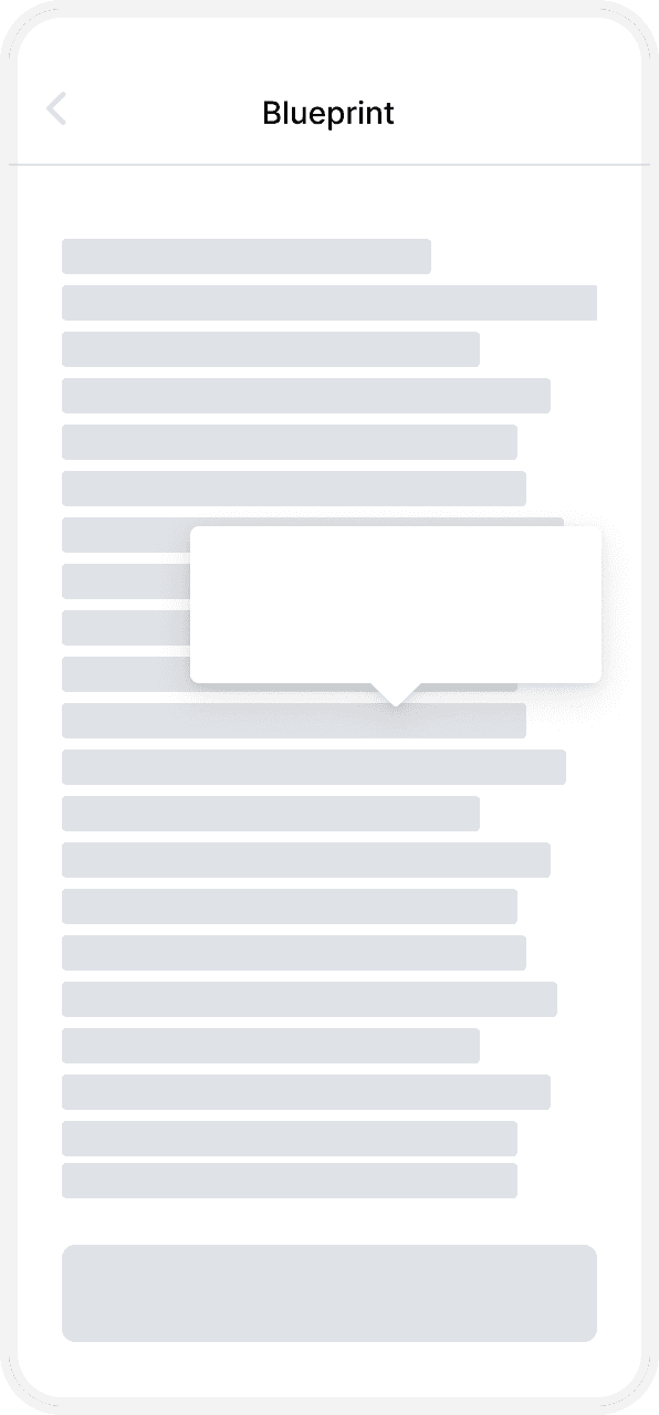
Larger drop shadows are applied to certain components by default

A scrimmed background and drop shadow focuses the user’s attention
Visual separation
Shadows can be used to visually differentiate between UI elements or groups of content. Shadows applied to Home cards, for example, reveal the card’s edges and reinforce that their content is similar when used consistently.
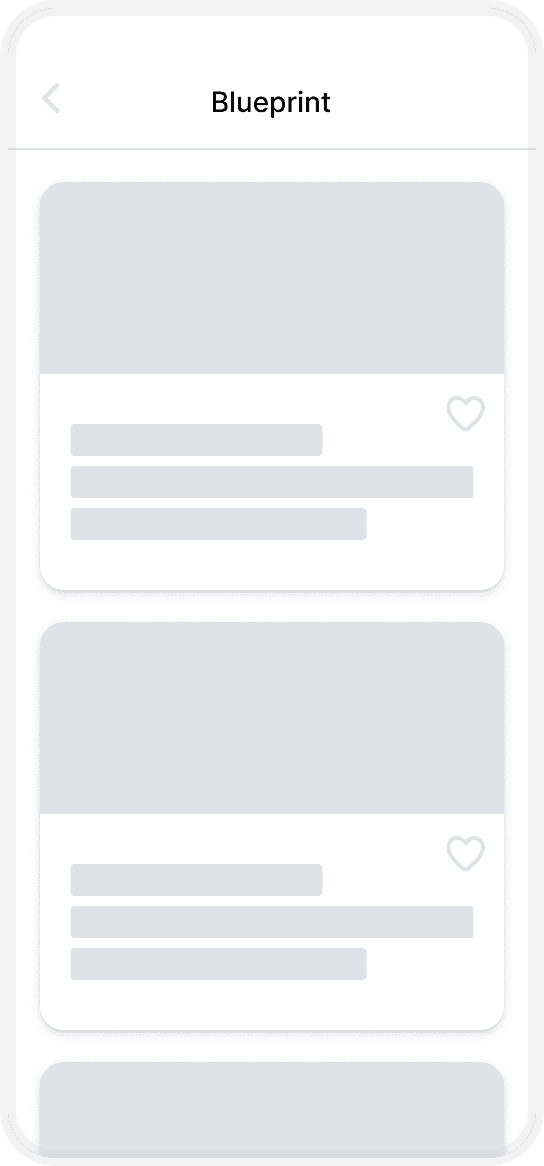
Consistent use of shadows reinforce similarity between elements

Subtle shifts in color and shadows help group related pieces of content
Layering content
Overlapping UI elements that need added contrast between them can utilize drop shadows to depict distance between surfaces. This can apply to controls on top of a map or communicate that a side panel moves independently of adjacent content.


Elevation resources

Shadow tokens
