
Grid
The grid system provides guidance on creating consistent and harmonious layouts.
Terminology
Columns
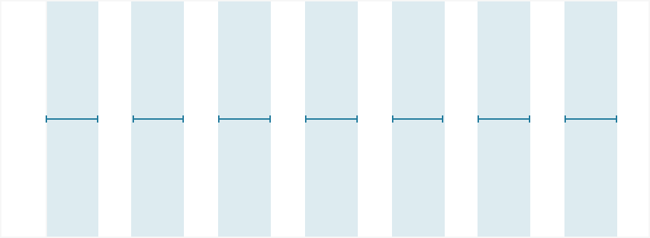
Columns set the content width of your design. In a fluid grid, column sizes can fluctuate and respond to the screen size.
Gutters
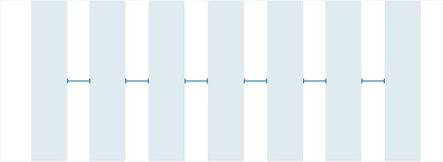
Gutters are the space between columns. Fixed gutter sizes assist in creating horizontal rhythm and consistency between elements.
Margins
Margins refer to the amount of white space outside the content width. Margins remain a fixed size even in a fluid grid.
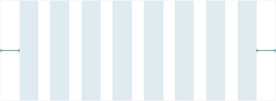
Container

The container refers to the entire grid width, including the margins. Containers establish the maximum content width for your page.
Our approach
Fluid grid
Fluid grids are dynamic in that elements within a fluid grid will grow and shrink depending on the user’s screen size. Design Systems recommends use of the fluid grid in most cases as it allows for maximum use of screen real estate.
Fixed grid
A fixed grid allows content to rest within a certain number of columns set to a fixed size. The layout of a page will adapt at certain breakpoints to accommodate the user’s screen size.
The grid system is currently only available as design guidance
Breakpoints
Although we’re applying a fluid grid system, breakpoints provide reference points to design for each screen size.
Within a breakpoint, the column count is constant, and design elements scale with screen size.

Min width (px)
Breakpoint
Columns
Gutters (px)
Margins (px)
Grid width
Below 320
XS
6
16
16
320px
320
S
6
16
16
100%
600
M
12
16
32
100%
1200+
L
12
16
32
1200px, centered
Usage and best practices
Padding
Consider content width for certain elements like text boxes. Provide padding inside the larger container that sits within the grid system.

Text boxes sit too closely together and can impact readability
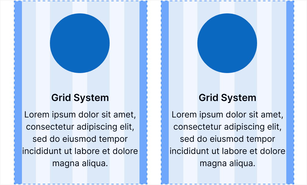
For better readability, consider padding inside each text box
Nesting elements
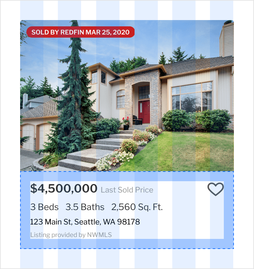
Content within a parent design element does not need to align to the grid system. (i.e. HomeCards)
Content width
Utilize all columns for content width. Unless intentional, there’s no need to nest content within the grid. Margins account for the white space on either side of the page.
