
States
States visually communicate the status of a component or other interactive UI element.
Types of states
Enabled/Default
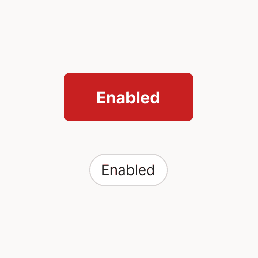
The default state that communicates a component can be interacted with.
Disabled
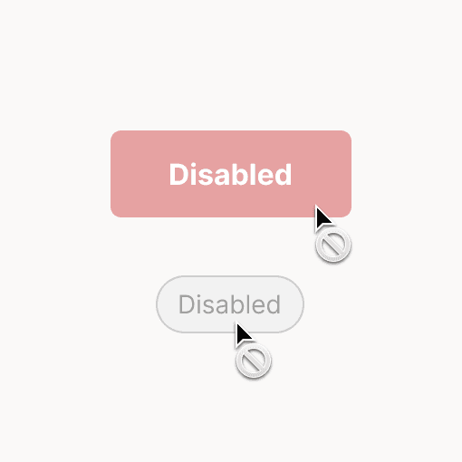
Disabled states show an element exists but isn't interactive. Disabled states do not need to meet contrast requirements.
Focused
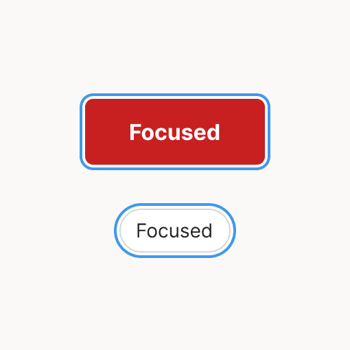
A focused state communicates a user has highlighted an element using an input device like a keyboard.
Hover
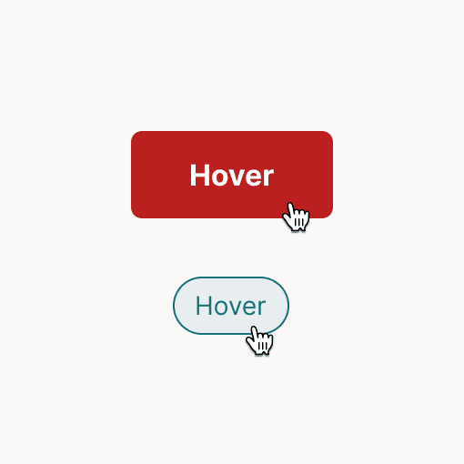
Hover states appear when a user has places their cursor over an interactive element.
Pressed
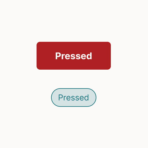
A pressed state communicates a user tap or press interaction.
Selected
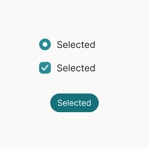
The selected state communicates a user's choice.
Applying states
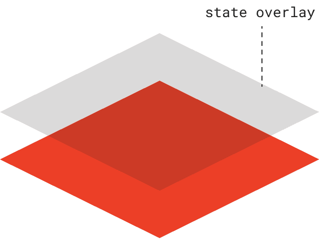
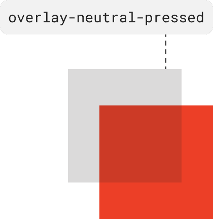
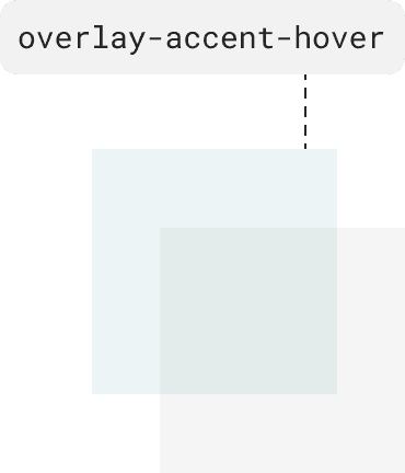
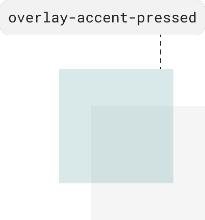
State overlays allow for greater level of scalability and predictability across our UI. These overlays have fixed opacities and are defined in both neutral and accent variants.
Overlay variants
Overlays can be applied to components in either neutral or our defined accent color. Depending on your design, neutral overlays are typically applied to secondary or tertiary components while accent overlays are applied to components needing extra emphasis.
State overlay tokens
Value
rgba
Token
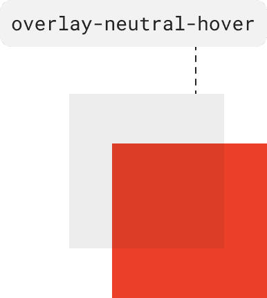
color-warm-gray-900 @8%
(36, 34, 32, 0.08)
color-overlay-neutral-hover
color-warm-gray-900 @16%
(36, 34, 32, 0.16)
color-overlay-neutral-pressed
color-accent @8%
(21, 114, 122, 0.08)
color-overlay-accent-hover
color-accent @16%
(21, 114, 122, 0.16)
color-overlay-accent-pressed
Color resources

Color tokens
