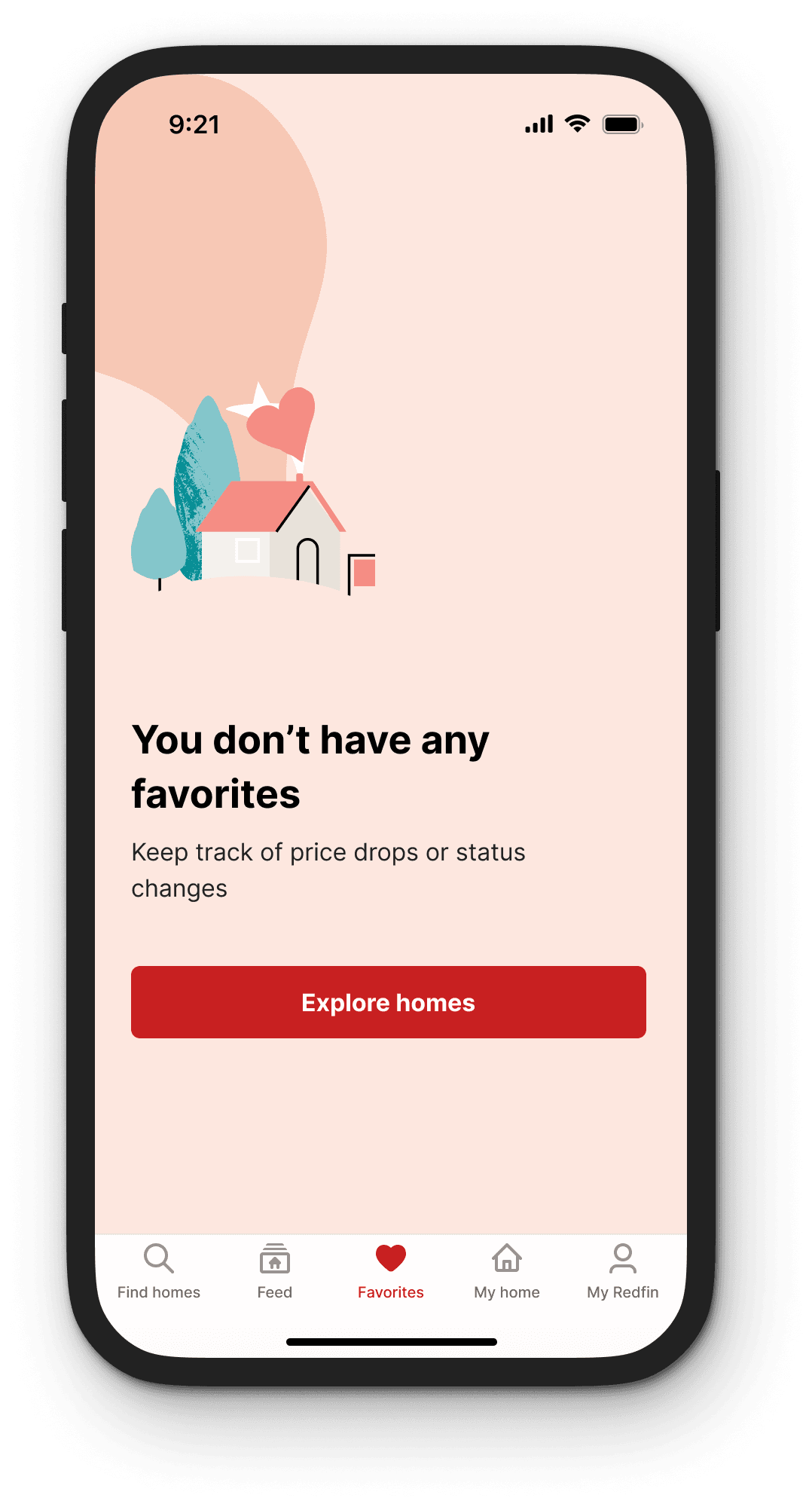
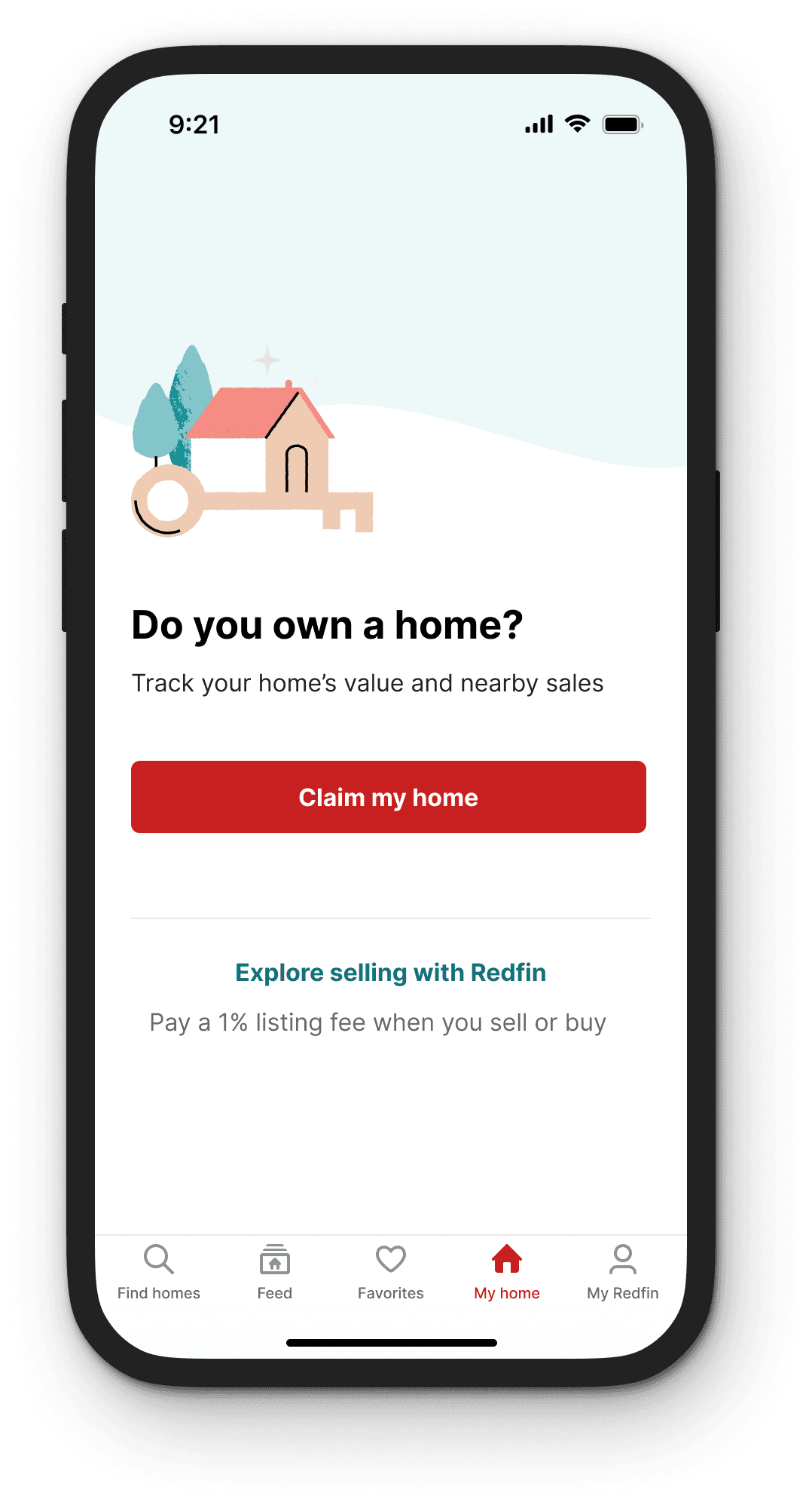
Empty states
Empty states appear when there is no data to display to the user. Empty states are full of potential to drive engagement and delight users, especially for those who are new. Providing a good first impression can lead users to remain engaged. Good empty state design elevates user onboarding experience, builds brand awareness, and personalization.
Key principles
Empathize
Surprise, delight, emotion, personality
Educate
Provide users helpful guidance
Encourage action
Content to help user visualize what they can do and prompt them to take action
Impact & polish
Provide clear and consistent designs that represent Redfin’s brand and mission
Best practices
Use engaging illustrations or animations
Help the user stay engaged and interested in Redfin. Illustrations can help convey tone, movement, energy, or stability, with different ones used for positive, neutral, or negative situations.

Keep it consistent
• Consistent use of (no) punctuation at the end of text
• Consistent style illustrations with the same theme
• Keep body copy text color the same
• Use left or center alignment for all the empty states
• Consistent spacing
• Keeping buttons consistent
Best practices for copy
Effective copy can improve the usability of apps and websites.
Headlines
Large, bold word or phrase that users notice first and should deliver key information of a page.
Subheaders
Brief or concise phrases that help users scan text to gauge interest.
Body copy
Providing description or further information in a compact block under subheader or headline.
CTA
CTA button are calls to tell users what action they will take if they click on it.