
Show/hide information
In order to help users navigate and interact with large amount of information or complex interfaces, there are different components and patterns that can be used to show and hide information.
Small or additional information
Accordion
An accordion is a component that expands and collapses content. This component is useful for showing and hiding detailed information or for organizing content.

Dialog
Modals are a type of dialog box that appears on top of the content and typically requires user interaction to dismiss.

Expandable
The expandable component allows information to be expanded or collapsed to reveal more information.

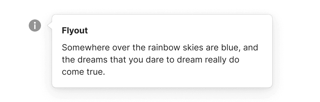
Flyout
A flyout can give users additional context, definitions, and other supporting messages.
Larger blocks of information
Dialog
Modals are a type of dialog box that appears on top of the content and typically requires user interaction to dismiss.

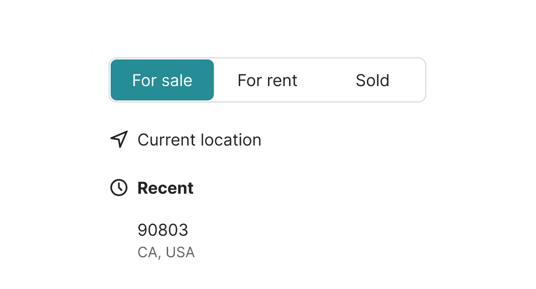
Segmented control
Segmented controls allows users to choose from a set of mutually exclusive options divided into multiple segments.
Tab bar
Tabs allow users to switch between different sections of content. Tabs are useful for organizing large amounts of content and presenting it in a clear and organized way.
