
Loading states
Progress indicators, like loading UX, help assure users that the system has understood their input and that progress is being made by giving appropriate feedback on users’ actions.
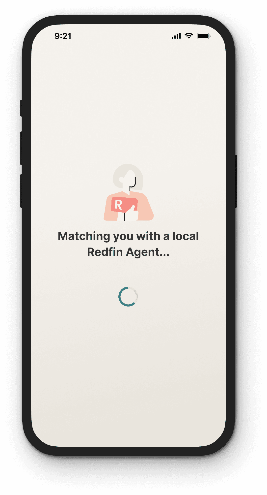
Loading animations
Looped animation
Actions that take <10 seconds
Showing an animated graphic on loop offers feedback that the system is working
Looped animations are used for fast actions - make processes feel more instant
We don’t recommend looped animation for actions that take longer than 10 seconds, because users quickly grow impatient if they feel like they aren’t making progress
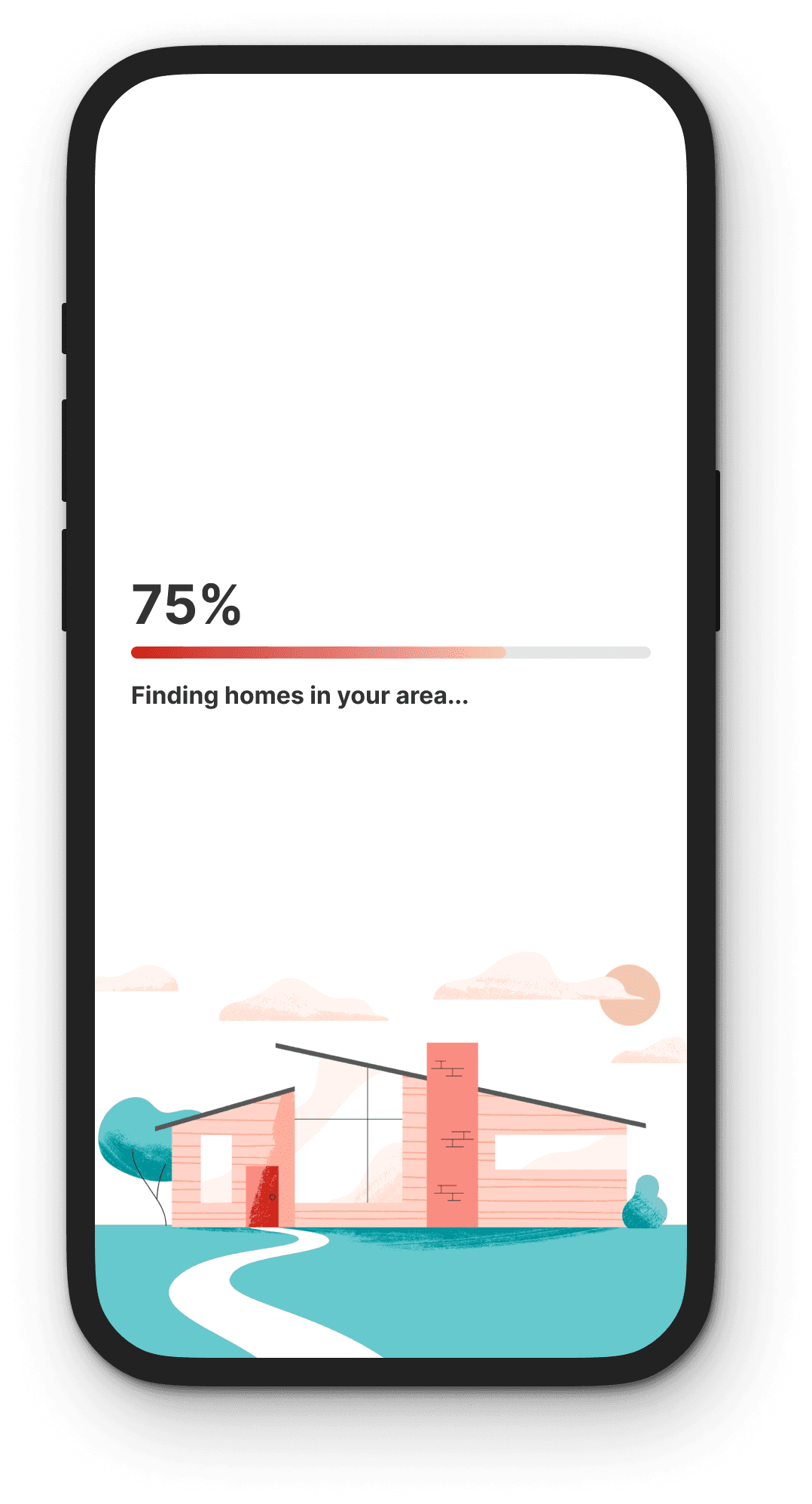
Percentage done
Actions that take 10+ seconds
Use for actions that take 10 seconds or more
A visual indicator that progresses towards completion puts the user at ease and increases their willingness to wait
Skeleton states
Skeleton screens help users focus on their tasks by providing a distraction-free view while they wait for content to load. This state helps users visualize how the page will look when it finishes loading and it provides feedback when there is activity going on in the background.
Users may perceive loading times as shorter in duration when shown a skeleton screen than when shown a spinner or a blank screen, even when the waiting period is the same.
Skeleton animations
They’re usually designed in greyscale in a way that replicates the actual layout of the page without being distracting
Usually, these animations are subtle; such as a shimmer that moves from left to right, impersonating how users would read the content

Lazy loading
If expected load times are exceedingly long, it might even be worth considering lazy loading instead — the practice of only displaying what’s necessary on the page, while the rest of the content loads in the background.
Inline loading
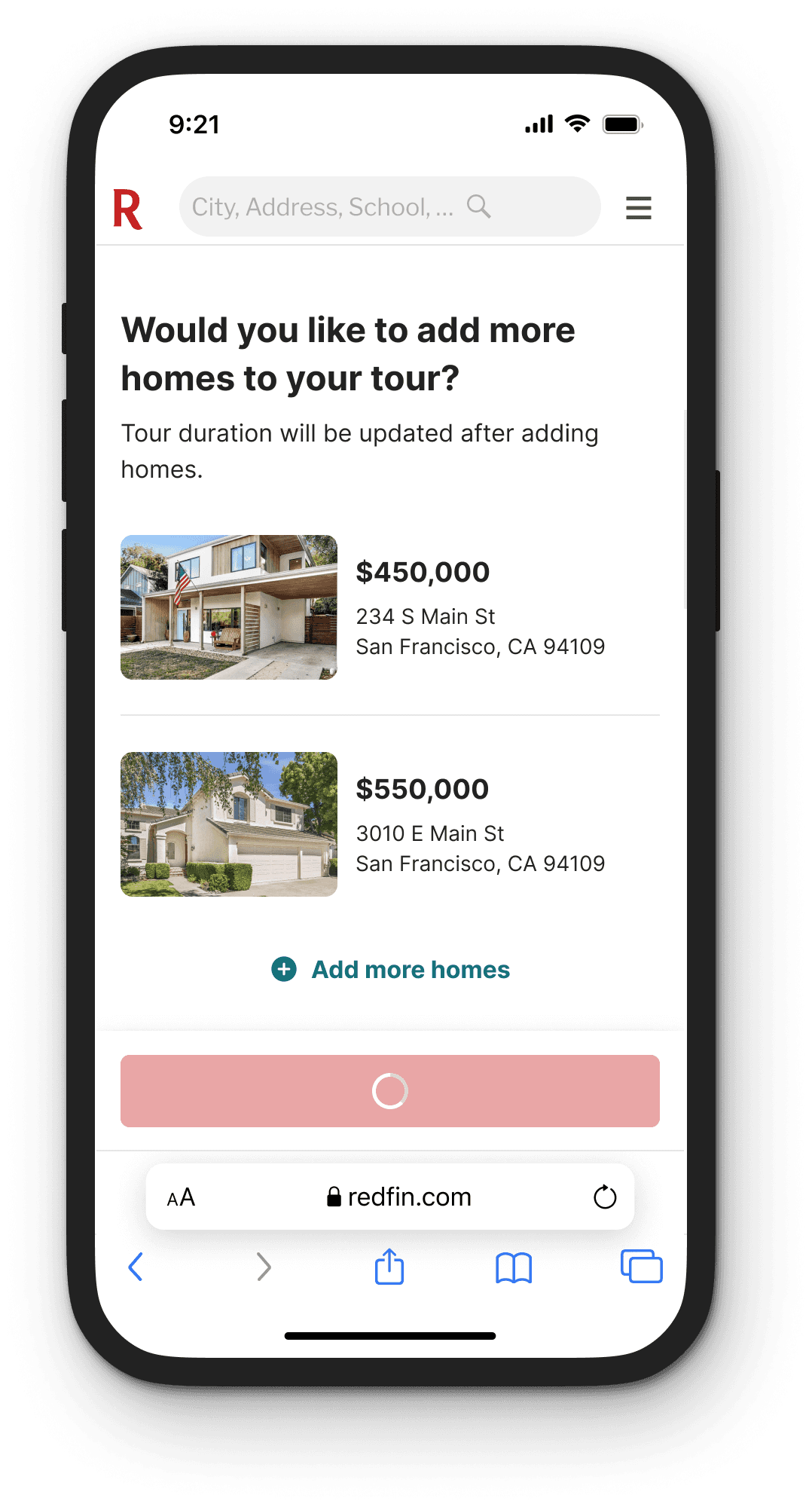
Loading buttons
A loading indicator can be integrated into a button or actionable icon
The looped animation is generally used to indicate an action isn’t available or the system is loading
