
Modality
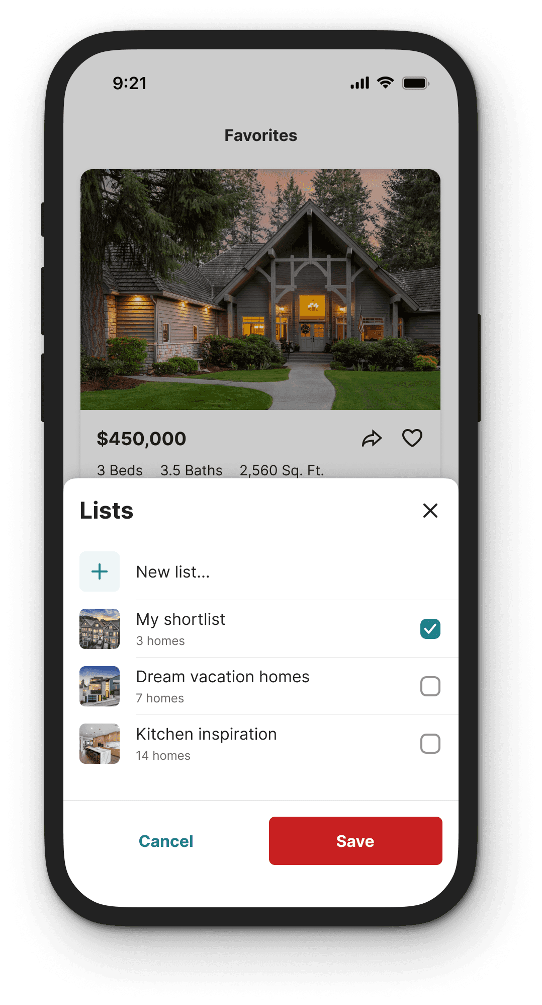
Modals appear in front of content to provide additional information, ask for a decision, or to complete short tasks. Users must interact with the window in order to return to the parent information.
Types
Modal
Modal screens require the user to complete an action or cancel the current action before returning to the main window.
Non-modal
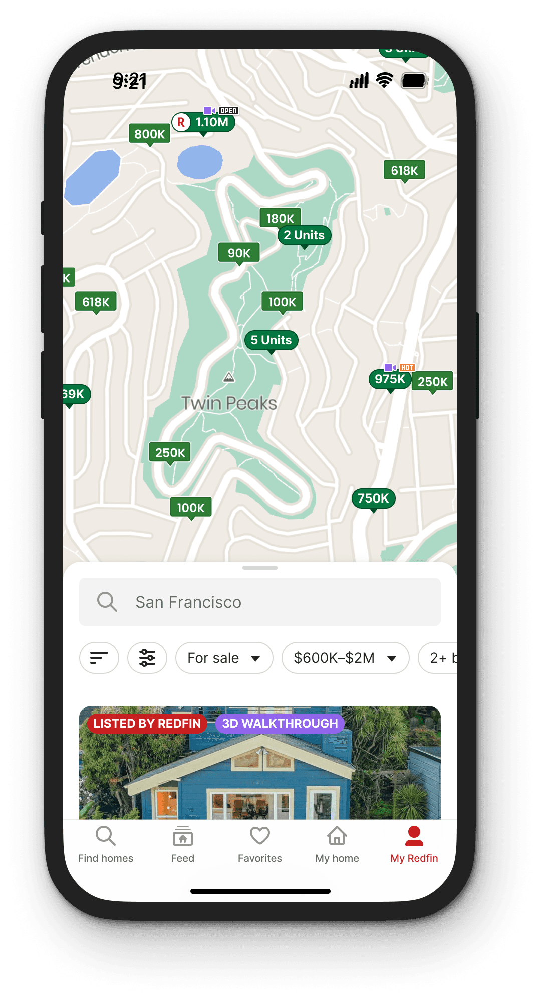
Non-modal screens allows the user to go back to the parent screen and/or does not block users from interacting with elements on the parent screen.
Usage
Why should modality be used?
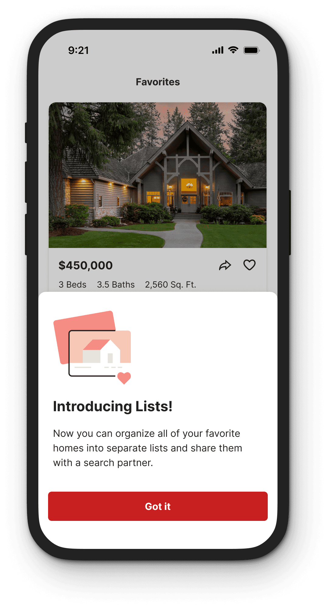
Modal screens require people to focus on a single task before continuing and are less disorienting than navigating to a new page.
When should modality be used?
Use modals screens for short tasks with a clear start and end or to alert the user to task relevant information.
When should modality be avoided?
Avoid modals for complex decision-making that requires additional sources of information unavailable in the modal.
If a modal requires the user to do complex research or consult additional sources of information (potentially blocked by the modal), then consider another interaction.
Designing modals
CTA placement
Dialog
Use modals screens for short tasks with a clear start and end or to alert the user to task relevant information.
Primary
Dialog
Use modals screens for short tasks with a clear start and end or to alert the user to task relevant information.
Tertiary
Secondary
Primary
• Primary actions are always the outmost right position on desktop
• Secondary actions are always the outmost left position on desktop
• There should only ever be one primary action
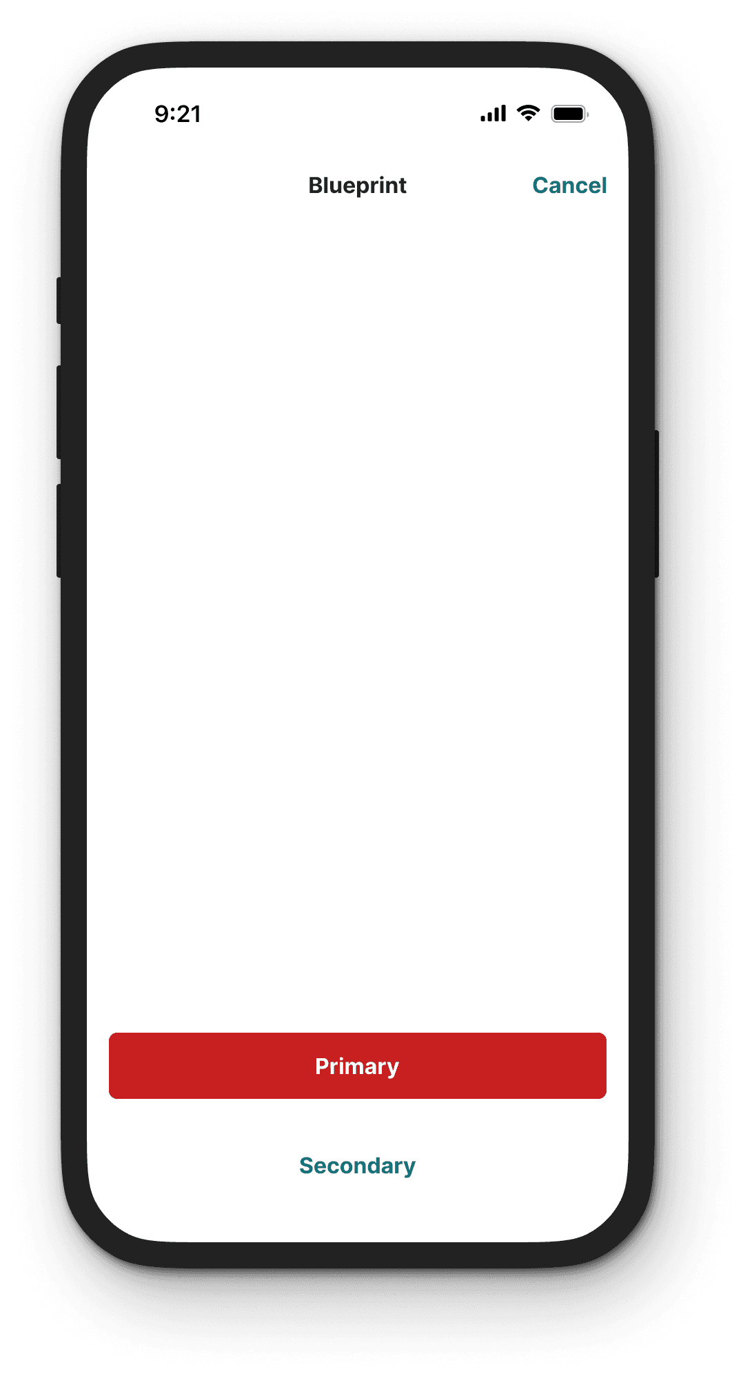
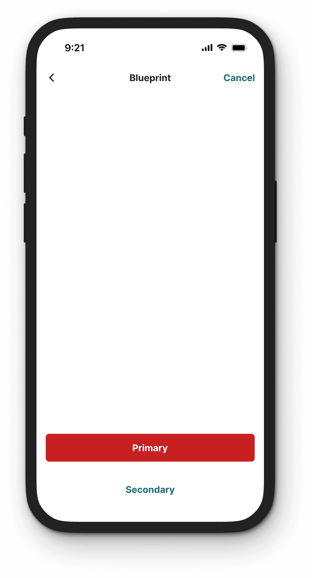
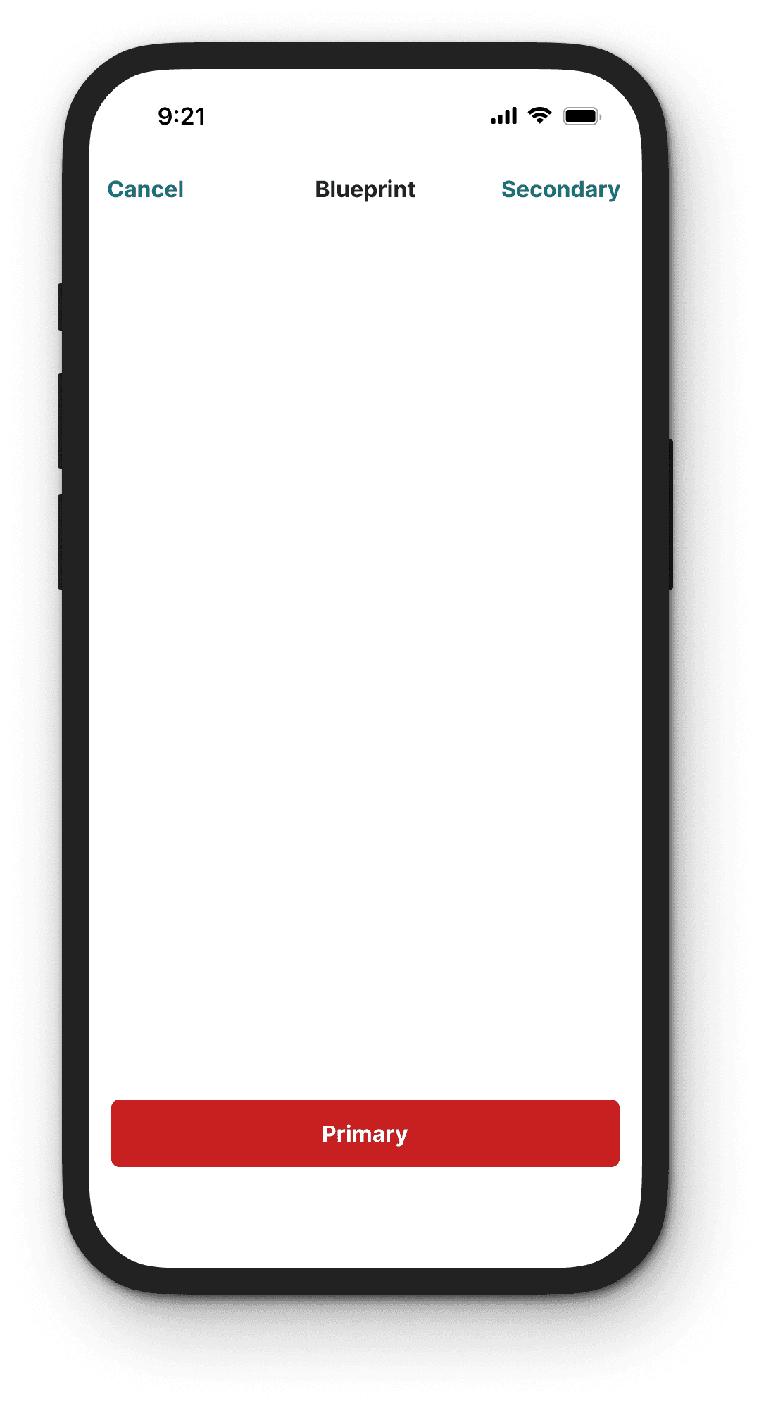
• For consistency, “Close” or “Cancel” options should remain in the top right position
• When paired with a Primary or Secondary action, “Cancel” moves to the top left position
CTA labels
Dialog
Use modals screens for short tasks with a clear start and end or to alert the user to task relevant information.
No, ask me later
Yes, download the update now
Dialog
Use modals screens for short tasks with a clear start and end or to alert the user to task relevant information.
Ask later
Download update
• 1-2 words is deal (5-6 words max)
• Sentence case
• Avoid punctuation
• Should reflect what will happen once clicked
"X" icon, Cancel, Close, Done
Using an "X" icon inside dialogs can be confusing for users because it can mean different things like closing or deleting something. This can cause mistakes and frustration for users. Designers should use clear labels like "Close" or "Cancel" instead of an "X" icon to avoid confusion.
Scrolling
Dialog components come in 4 sizes, each with a predefined width. If the content is longer than the height of the dialog, then the body section should scroll vertically with the header, and the footer should remain fixed.
Scrolling dialog demo
Dialog components come in 4 sizes, each with a predefined width. If the content is longer than the height of the dialog, then the body section should scroll vertically with the header, and the footer should remain fixed.
Paragraph break
Dialog components come in 4 sizes, each with a predefined width. If the content is longer than the height of the dialog, then the body section should scroll vertically with the header, and the footer should remain fixed.
Paragraph break
Dialog components come in 4 sizes, each with a predefined width. If the content is longer than the height of the dialog, then the body section should scroll vertically with the header, and the footer should remain fixed.
Ask later
Download update

