
Forms
Use forms to allow users to enter data. Forms are used to get information and guide users with minimal fuss. Designing forms well requires making decisions about structure, sequence, interface elements, field labels, help, and feedback.
Layout
Z pattern
The Z-pattern is ideal for forms within a container.
F pattern
The F-pattern is ideal for forms that are unconstrained.
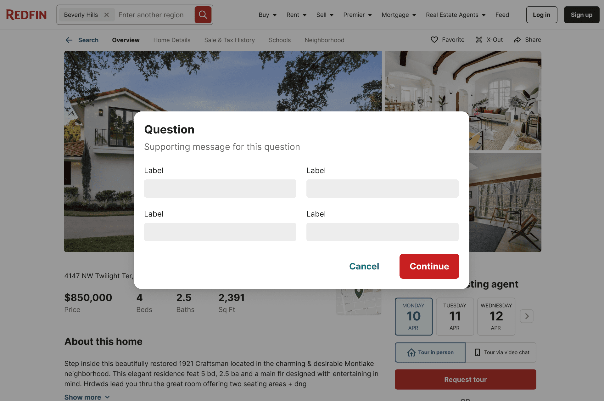
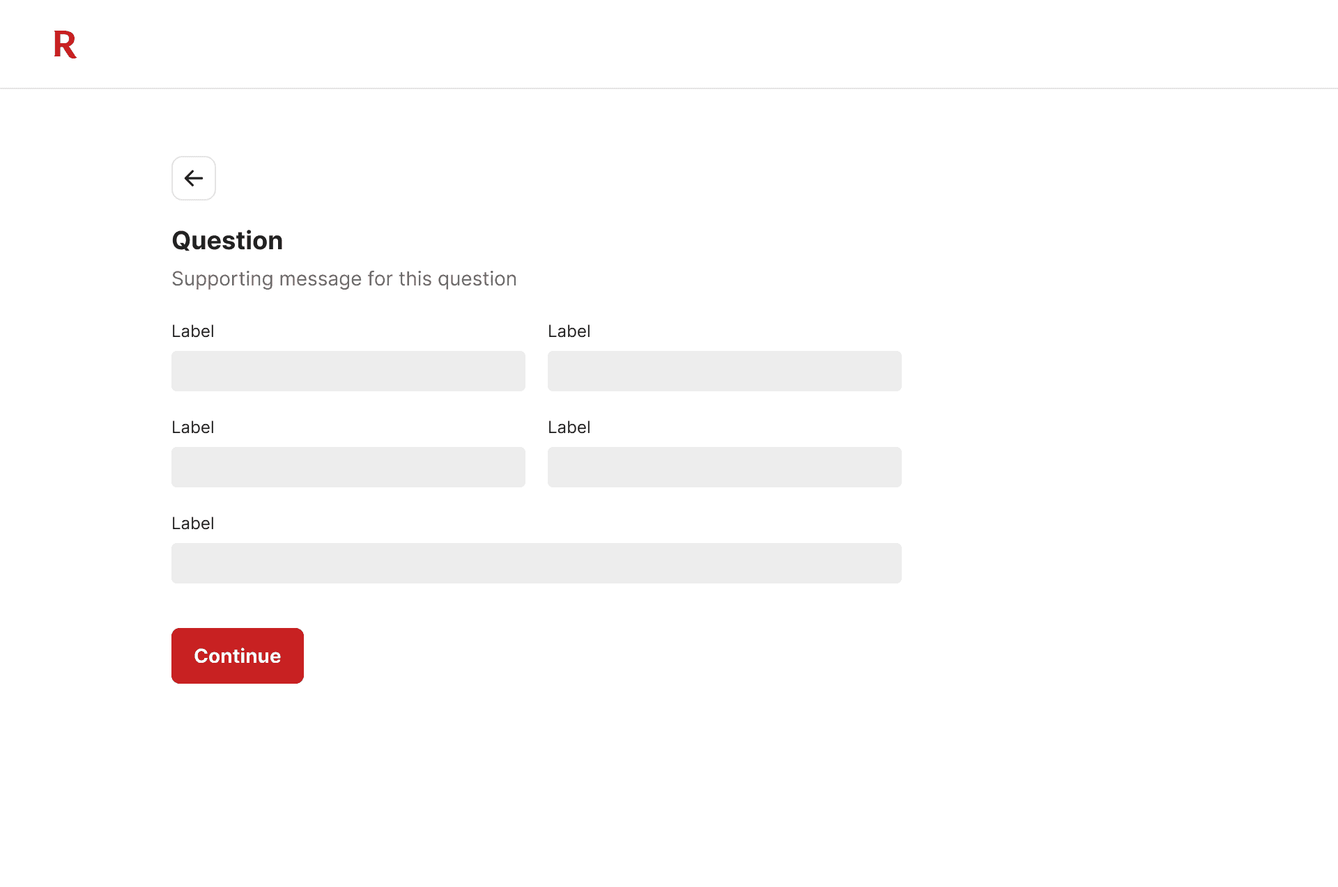
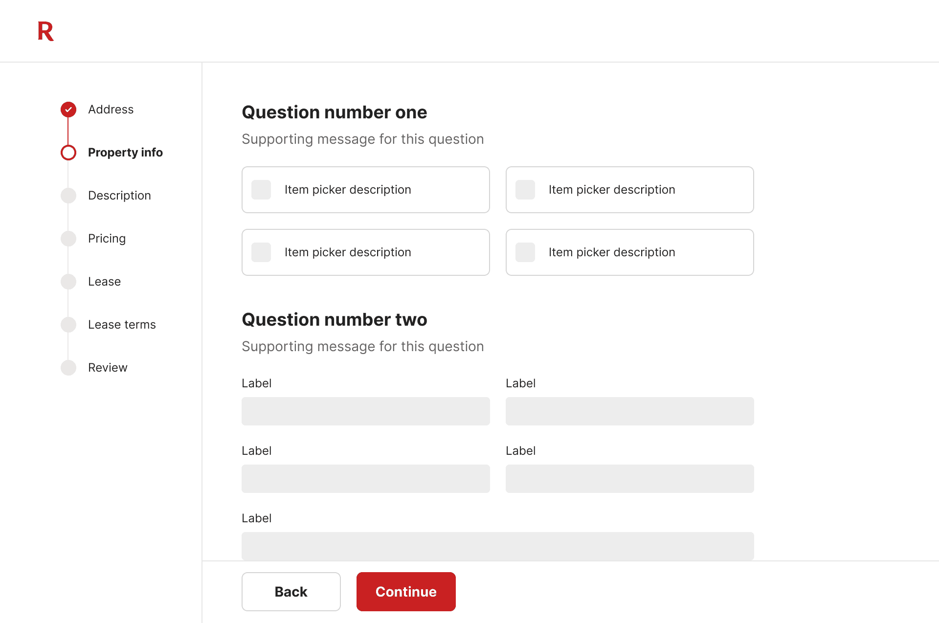
CTA placement
Short forms

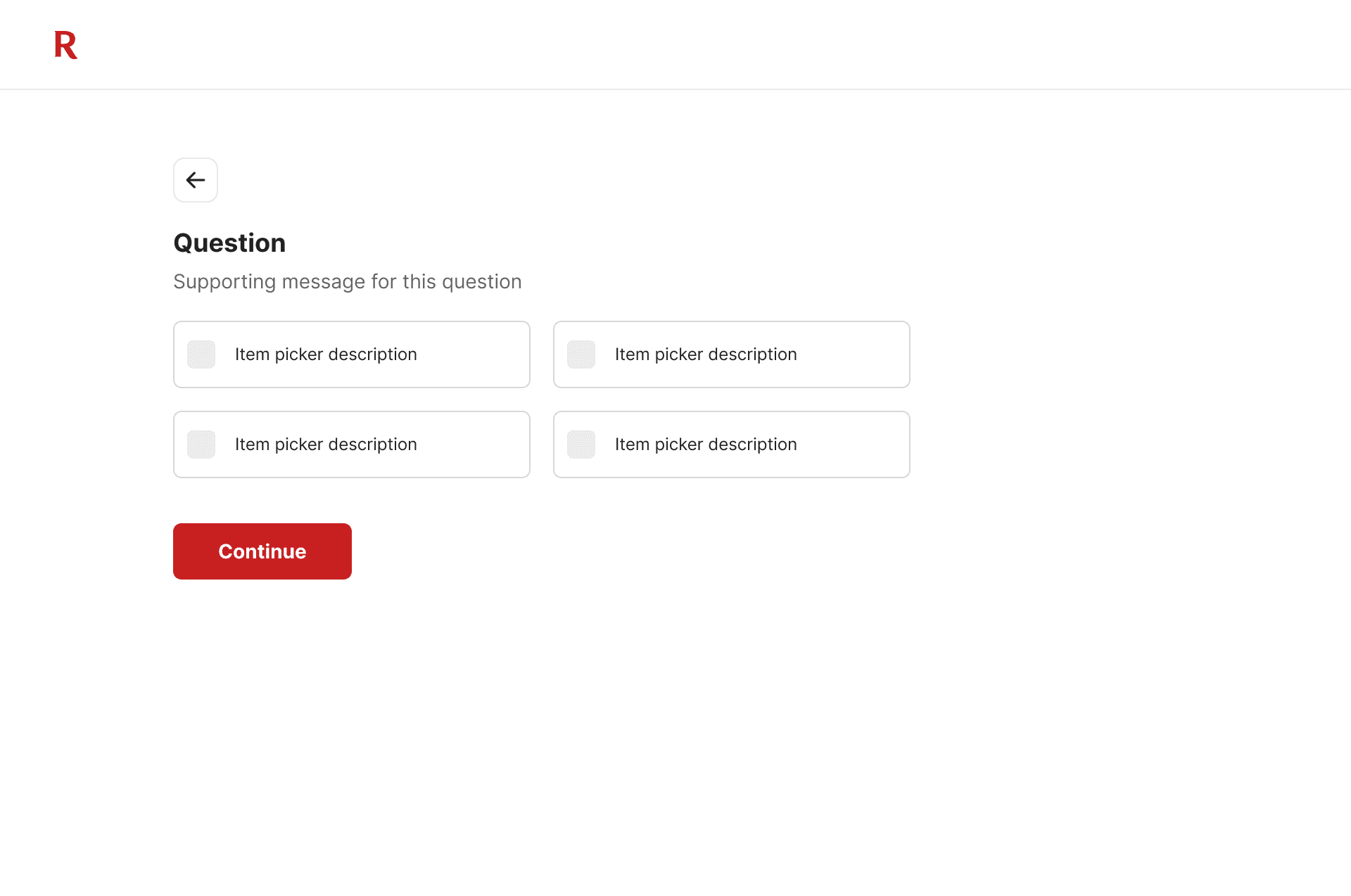
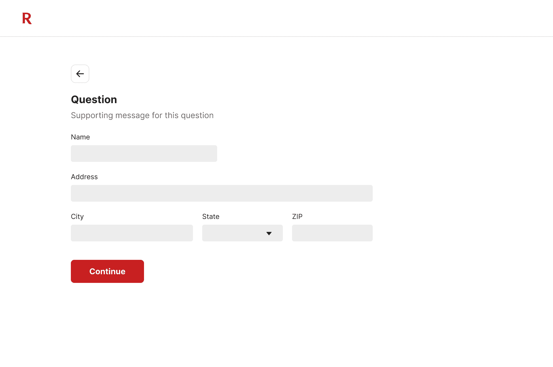
Natural flow
Placing the CTA immediately after the last field of the form follows a natural flow of completion. Additionally, users won’t need to look or navigate to the primary CTA.
Contextual awareness
Users find it more intuitive to find the CTA close to the last field they filled out, as it's contextually relevant to the completion of the form.
Reduction of clutter
Placing the CTA at the end of the form can reduce clutter, especially in shorter forms.
Long forms & flows
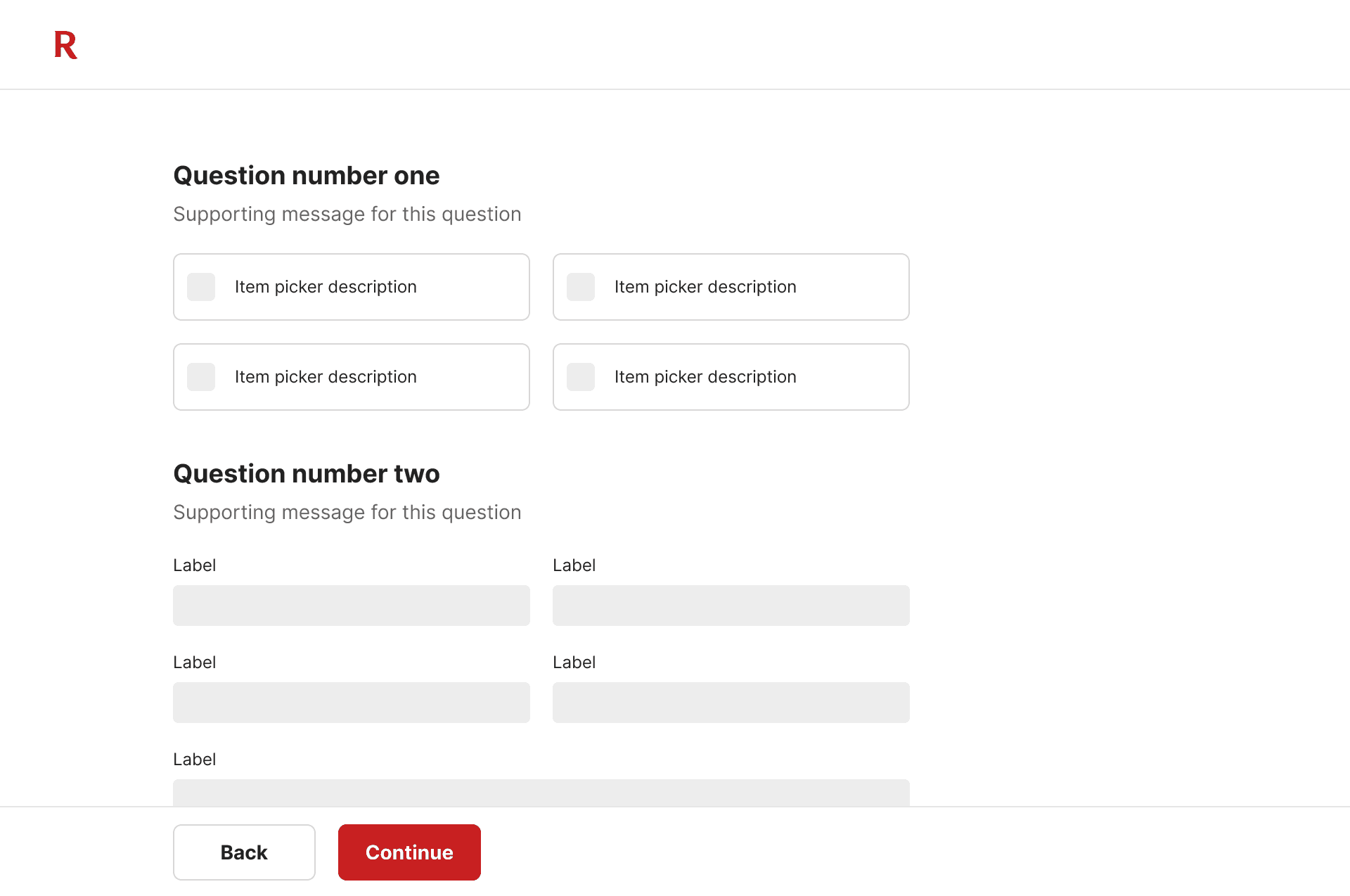
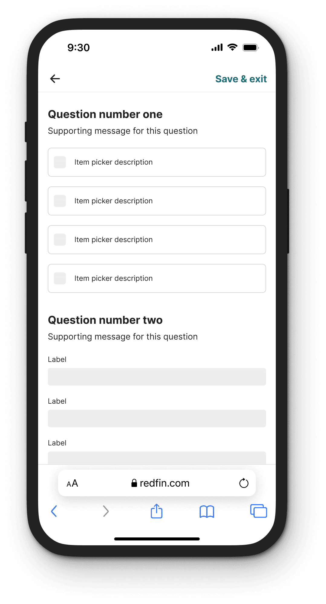
Accessibility
Placing the CTAs in a sticky footer ensures that it's consistently accessible regardless of where the user is in the form, especially for longer forms where users may need to scroll down extensively.
Visibility
A sticky footer ensures that the CTAs are always visible, which can encourage users to move forward in the form without having to search for the button.
Consistency
Having the CTAs at the bottom of the viewport provides a consistent user experience, as users won't have to adjust to different layouts as they progress through the form.
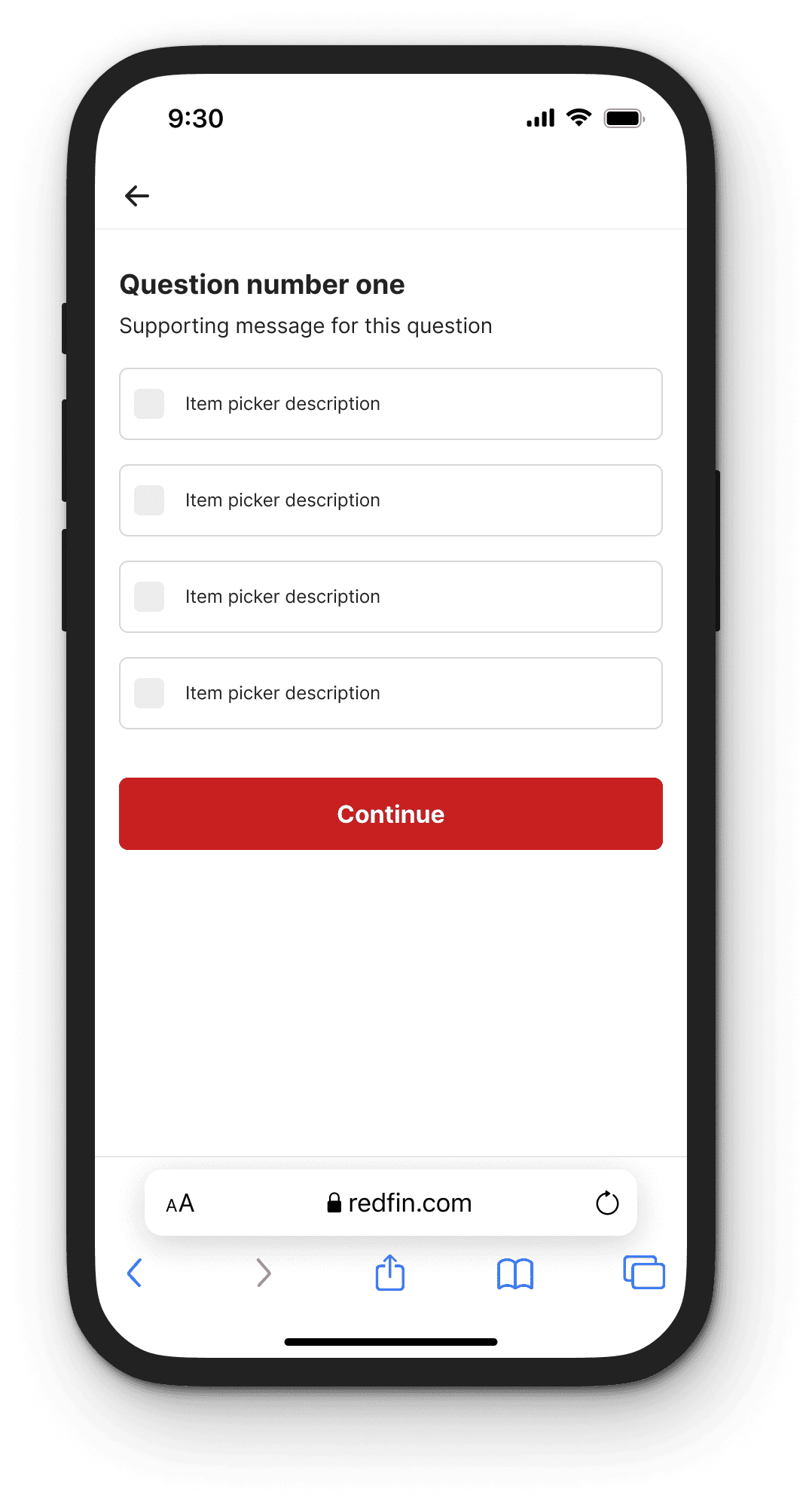
Mobile
Mobile layouts place CTAs at the bottom of the form regardless of size. Placing the CTA immediately after the last field of the form follows a natural flow of completion on mobile devices.
Design
Form field width
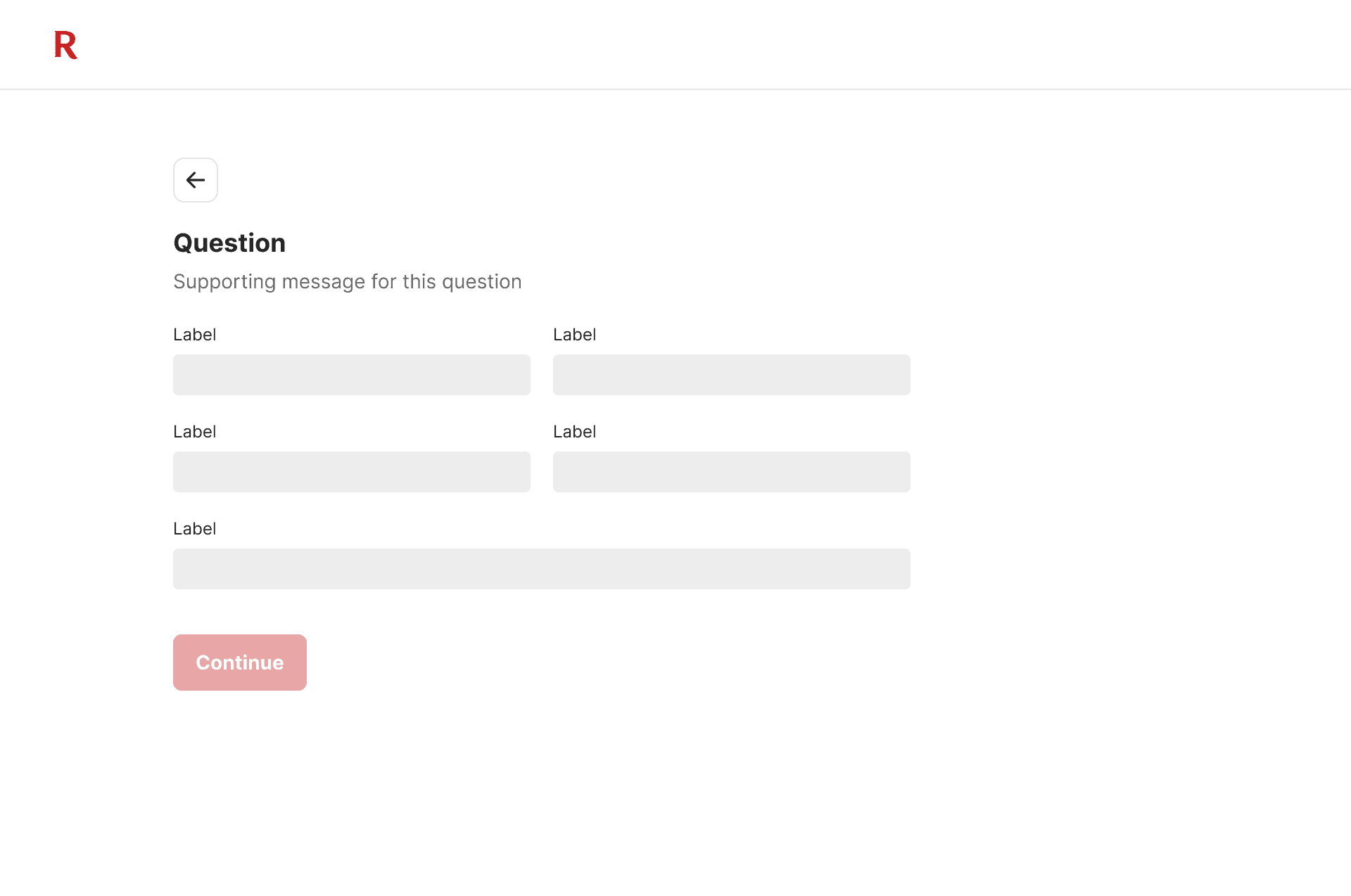
Sizing all form fields the same width can increase the cognitive effort needed to complete the form. Width should give users a clue as to the length of the content it requires.
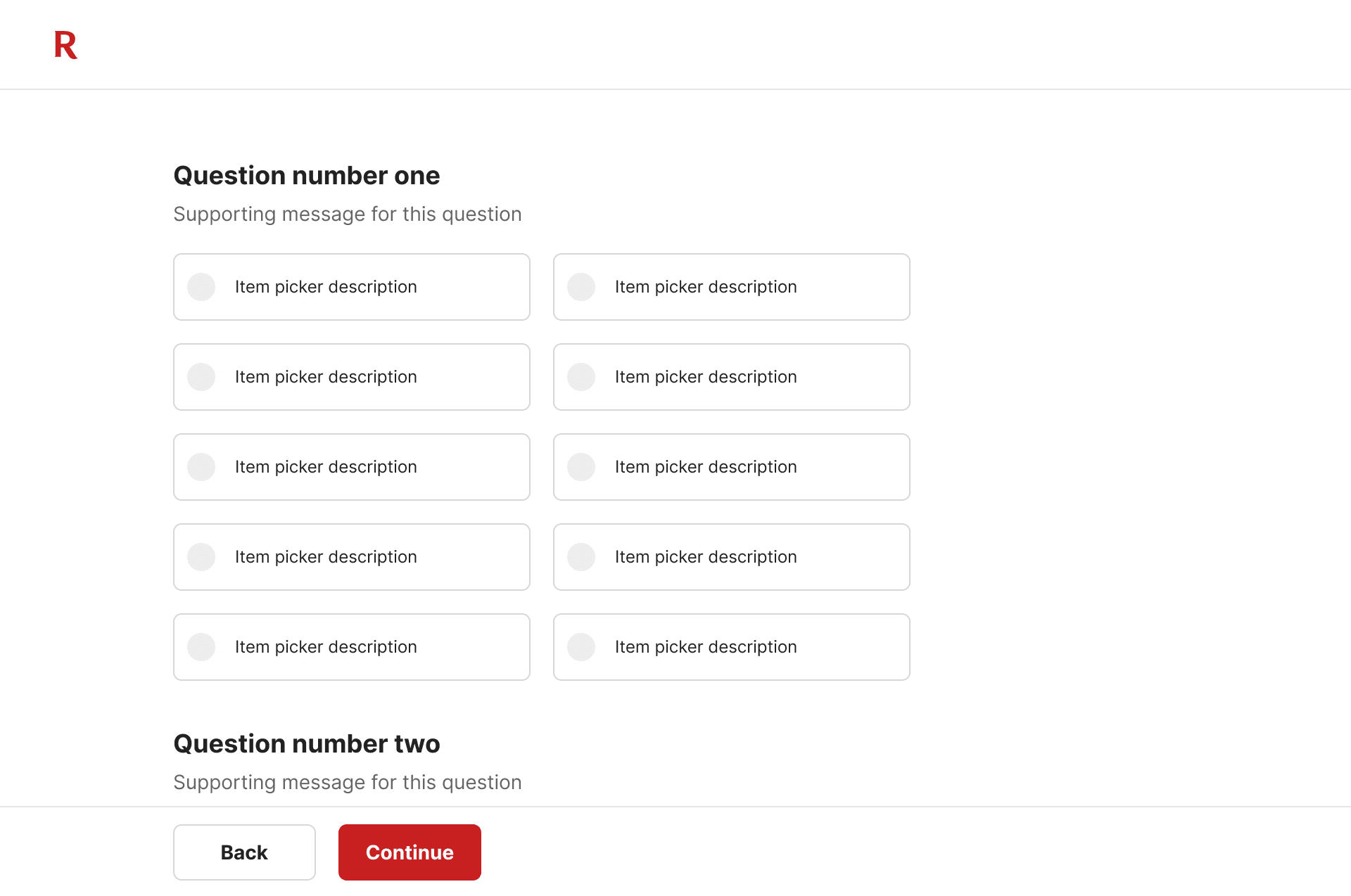
How many options should we provide?
Miller’s law recommends that we shouldn’t present users with more than seven options at a time. If you have more than seven, it's recommended to use the Select component.
Disabling CTAs
Disabling CTAs unnecessarily removes control from users despite the goal of providing clear feedback. Firstly, it leaves users uncertain about the specific errors in their entries. Secondly, disabled buttons are not easily discoverable for blind users navigating with the Tab key. Lastly, the grayed-out appearance of disabled buttons can make them difficult to read.
Form elements
Form elements can guide users through questions or entries. Different elements are used to provide additional context, provide supplemental information, definitions, or clues about formatting.
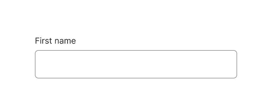
Label
Descriptive labels provide context and guidance
• Use simple language and avoid jargon
• Use sentence case except for proper nouns
• Ensure consistent style, formatting, and alignment
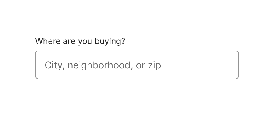
Placeholder
Placeholder text can hint on what to enter
• Used when formatting is unfamiliar
• Unusual type of input
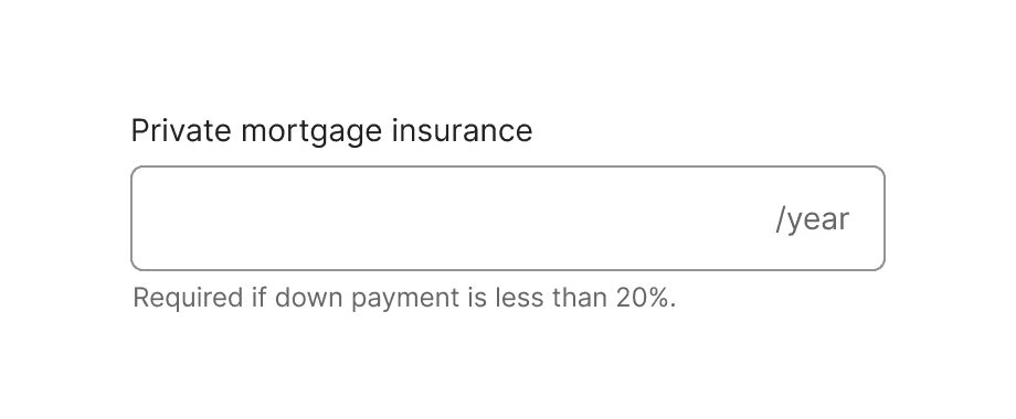
Helper text
Helper text communicates need to know information
• Clarifies requirements for an input
• Can communicate proper formatting
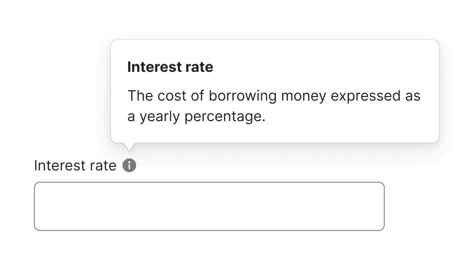
Info icon
The info icon can be used for non-essential information
• Provides a definition
• Why we’re asking for this information
Errors
Effective error messaging helps users understand and fix problems within the form. Always show error states within the form, and use in-line errors whenever possible.
Crafting a good error message
Be concise. Don’t use more words than are necessary, but don’t omit words at the cost of clarity.
Be consistent. Use the same tone, the same words, and the same punctuation throughout.
Be specific. If you know why something has gone wrong, say so.
Be human, avoid jargon. Don’t use words like “invalid, forbidden, and mandatory.”
Use the active voice. Instruct the user what to do. For example, “Enter your name,” not “First name must be entered.”
Don’t blame the user. Let them know what’s wrong and how to fix it.
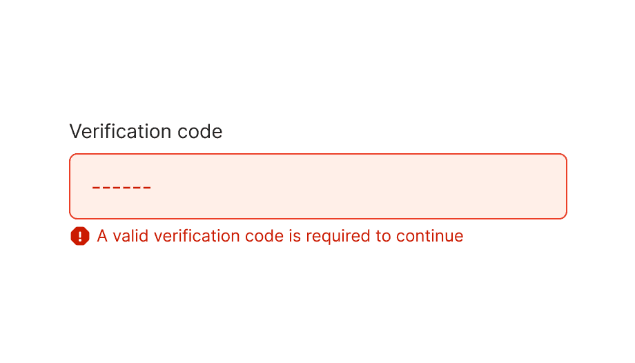
In-line errors
Use Helper text to indicate when a field fails or requires additional information.
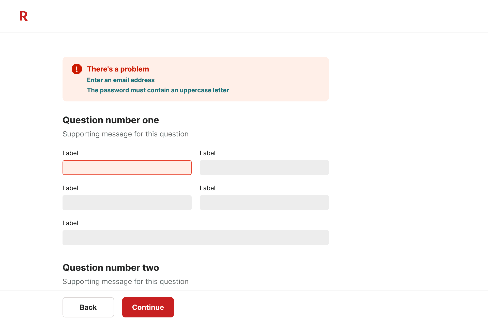
Multiple errors
For long form errors, error summaries are positioned at the top of the page so users don’t have to scroll down to see it after a page refresh. Underneath, there’s a list of error links. Clicking a link will set focus to the erroneous field, which lets users jump into the form quickly.
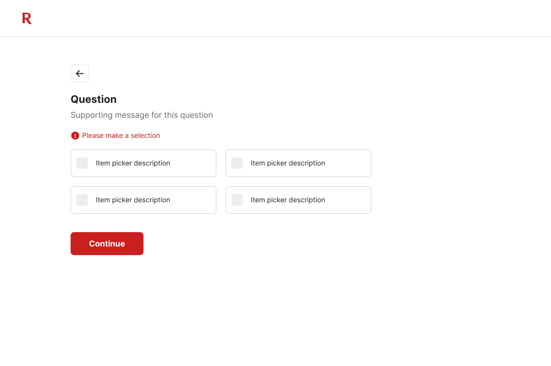
Radio buttons & Item pickers
Instead of highlighting all options in the form in red, use Helper text to communicate missing selections.

